

Snapiens
Snapiens was designed as a “second brain”, smart, connected, evolving, and human-centric. The identity translated this idea into a living visual system using neurons, glowing nodes, waves, and circular forms, carried consistently across the brand and product experience.
BRANDING, LANDING PAGE, PRODUCT DESIGN
Konsters
Konsters needed a brand that felt more premium, consistent, and trustworthy. We built the identity around the idea of a dependable “dad” who gets things handled, shaping the tone, tagline, and visuals around one simple promise: once it’s handed over, it’s done right.
RE-BRANDING, BRAND STRATEGY
Fluxx
Fluxx needed to make deep tech feel clear, credible, and investor-ready. The design balanced technical precision with a strong sense of innovation, using industrial and editorial visuals, dark backgrounds, blue and purple tones, and thin-line illustrations to communicate complex ideas more clearly.
LANDING PAGE DESIGN
Little Systems
Little Systems had 33 years of experience, but its brand didn’t reflect that depth. We built a new identity around reliability and accountability, using elements from their real automation systems, monochrome imagery, and sharp blue accents to create a precise, industrial presence.
RE-BRANDING, BRAND STRATEGY
Iconicli
Iconicli already had a solid foundation, but the website didn’t fully reflect the quality of its professional talent. We refined the strategy, messaging, and visual system to make the brand feel more focused, curated, and confident, with strong grids, bold typography, and editorial imagery.
LANDING PAGE DESIGN
Snapiens
Snapiens was designed as a “second brain”, smart, connected, evolving, and human-centric. The identity translated this idea into a living visual system using neurons, glowing nodes, waves, and circular forms, carried consistently across the brand and product experience.
BRANDING, LANDING PAGE, PRODUCT DESIGN
Konsters
Konsters needed a brand that felt more premium, consistent, and trustworthy. We built the identity around the idea of a dependable “dad” who gets things handled, shaping the tone, tagline, and visuals around one simple promise: once it’s handed over, it’s done right.
RE-BRANDING, BRAND STRATEGY
Fluxx
Fluxx needed to make deep tech feel clear, credible, and investor-ready. The design balanced technical precision with a strong sense of innovation, using industrial and editorial visuals, dark backgrounds, blue and purple tones, and thin-line illustrations to communicate complex ideas more clearly.
LANDING PAGE DESIGN
Little Systems
Little Systems had 33 years of experience, but its brand didn’t reflect that depth. We built a new identity around reliability and accountability, using elements from their real automation systems, monochrome imagery, and sharp blue accents to create a precise, industrial presence.
RE-BRANDING, BRAND STRATEGY
Iconicli
Iconicli already had a solid foundation, but the website didn’t fully reflect the quality of its professional talent. We refined the strategy, messaging, and visual system to make the brand feel more focused, curated, and confident, with strong grids, bold typography, and editorial imagery.
LANDING PAGE DESIGN
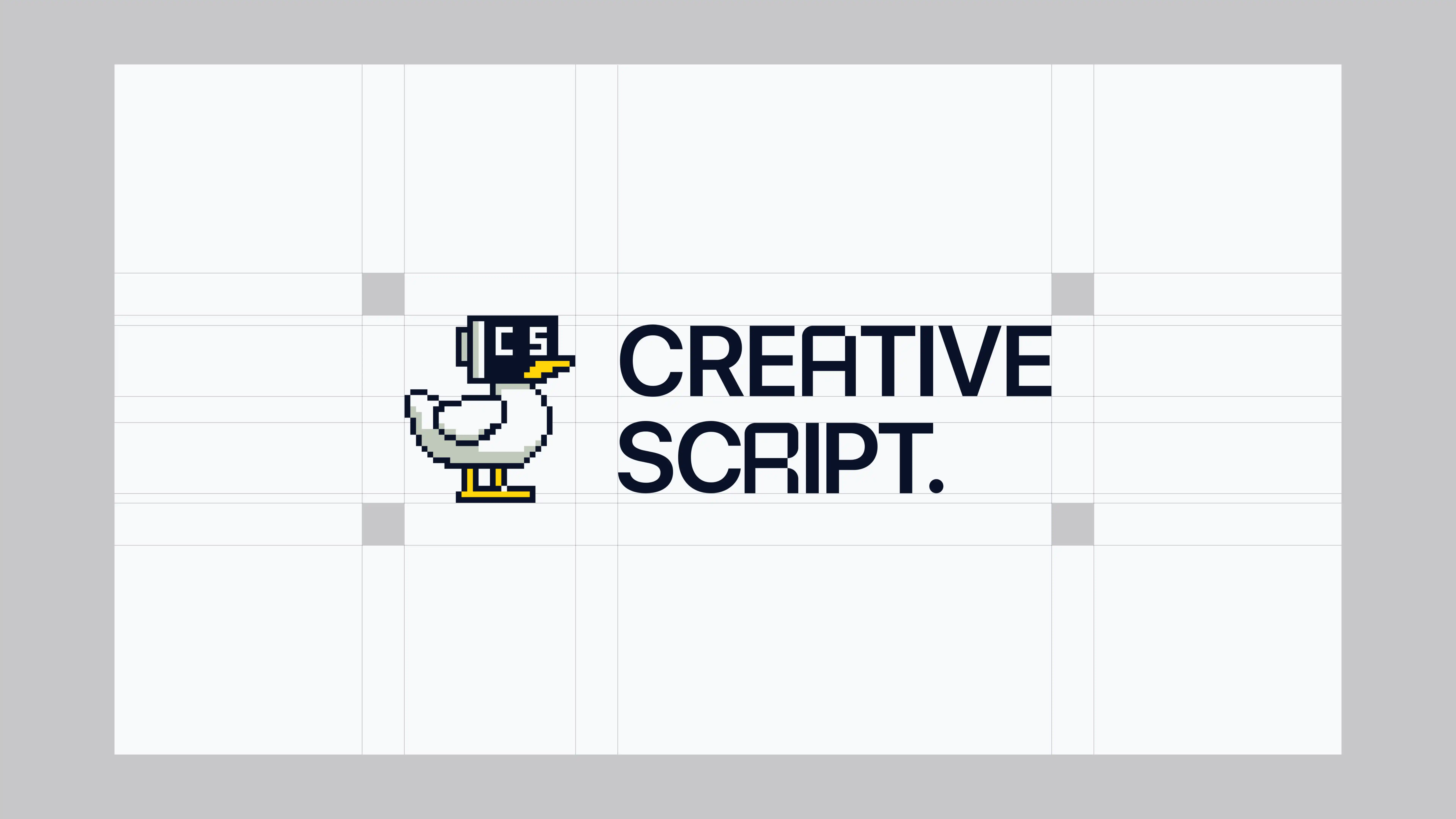
Creative Script
Started with initials. Ended up with a duck, lol.

Little Systems
Re-branding a 33 year old industrial automation company.

Konster
Re-branding Konsters: Bringing trust back to home services.
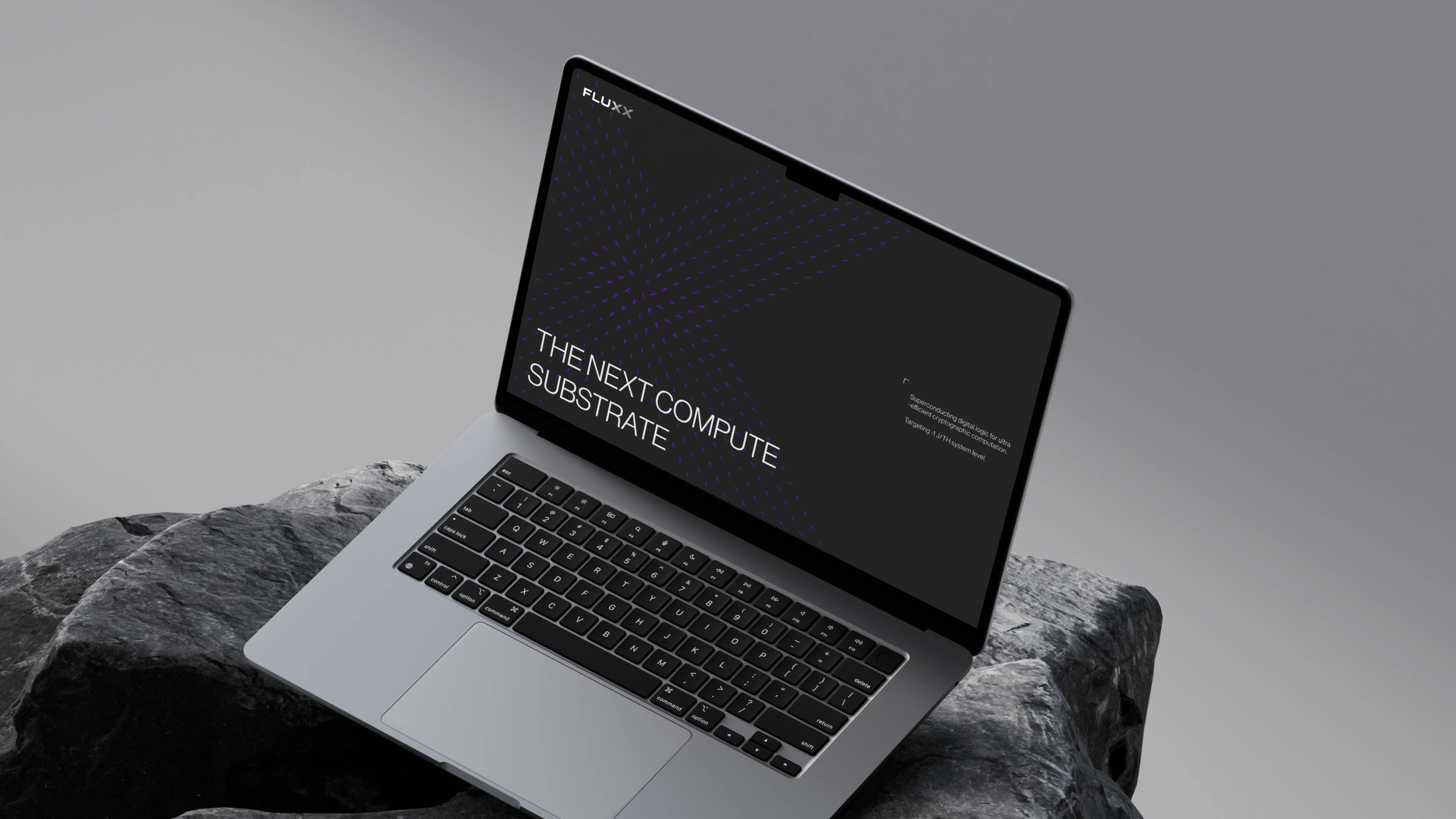
Fluxx
Making deep tech feel clear, credible and investor-ready

Unsafe enough to stand out [—] design and branding studio for the post ai world [—]
©2026 UNSAFE.DESIGN
INDIA
12:03 PM